Monday, 27 April 2015


Friday, 24 April 2015
MAGAZINE EVALUATION
Q1 In what ways does your media product use, develop or challenge forms and conventions of real media products?
https://prezi.com/wtuvweszupfl/in-what-ways-does-you-media-product-use-develop-or-challeng/
Q2 How does your media product represent particular social groups?
Q4 Who would be the audience for your media product?
https://prezi.com/51mhmj6euyo_/why-i-chose-my-magazine-style/
Q3 What kind of media institution might distribute your media product and why?
https://prezi.com/cr45u3vxhzh4/a-media-institute/
Q5 How did you attract/address your audience?
https://prezi.com/f3ty5oifc_a8/how-did-you-attractaddress-your-audience/
Q6 What have you learnt about technologies from the process of constructing this product?
https://prezi.com/7sa-8roosk2j/what-have-you-learnt-about-technologies-from-the-process-of/
Q7 Looking back at your preliminary task, what do you feel you haven't learnt in the progression from it to the full product?
https://prezi.com/giszjtwkxnoa/looking-back-at-your-preliminary-task-what-do-you-feel-you/
Tuesday, 21 April 2015
FINAL MAGAZINE
This is my final magazine and I have changed and developed on this throughout my production through evaluations and questionnaires. I have used sample groups and focus groups to see if my magazine is similar to a real one.


HOW I HAVE CHANGED MY MAGAZINE
I have changed my magazine through the production. I have changed and played around with fonts and their sizes to try and achieve the best look this is important to get the best look because this is important to link with the house style. I have tried adding different colours schemes and styles but I fell that the best theme through my magazine will be black, white and red this is because they are the most effective to the eye.
MAGAZINE FEEDBACK
I have had feedback on my magazine. Some of the questions that I asked my focus group were...
Cover Page Review ...

- What stands out the most on this page?
The focus group said that the most visually pleasing piece on the page was the band name. they said that this was because it was in a larger font size and a different font. they said that this was good because this allows the reader to see who the main focus of the magazine is.
Contents Page Review ...

- Do the red numbers go well with the house style and colour scheme?
This was an important point in my magazine this was because by adding a new colour this means that it changes the house style and colour scheme.
They said that this was good because it added another layer to the magazine and by having more colours on it helps to have focus points on the page which draw the eye in and make the reader want to look at that section of the page.
Double Page Review ...

- Does the block layout on this page work?
This was important because by using a block layout this means that the structure has to be neat and has to be aligned all correctly.
They said that this was good the three columns worked well and the left their of the artist title and pull quote work well. this is effective with the large letter in the background acting like a drop cap. also by having it in red this is good because it then links to the house style that is on the contents page with the page numbers.
MUSIC MAGAZINE MOCK UP


These are my magazine mock ups they are my original plans of my magazine. I have stuck to the main layout of my magazine. This is important to make a mock up this is because it allows you to have something to base the work around. This allows you to have something to compare you final work with and see if it is what you originally anticipated.
MAGAZINE MOCK UP

This is my mock up of my front cover and my actual front cover. they are similar because I had chosen to do a simple design this has allowed me to have a simple style that is consistent throughout my magazine.

This is my contents page mock up. I had originally wanted to do separate images with little to no text around them. I have kept the style and layout of the numbers and other main features I have just changed the arrangement of the images and the main text.


MAGAZINE COMPANIES
Bauer
Bauer Media Group is a large European-based media company, headquartered in Hamburg, Germany that manages a portfolio of more than 600 magazines, over 400 digital products and 50 radio and TV stations around the world. The portfolio extends to include print shops, postal, distribution and marketing services. Bauer Media Group has a workforce of approximately 11,000 employees in 17 countries.
Q started out as a music magazine published monthly in the United Kingdom. Originally it was to be called Cue (named after the act of cueing a record to play), but the name was changed so that it wouldn't be mistaken for a snooker magazine. The Q music brand has expanded to Radio and Television, with Q Radio and Q TV being music entertainment that specialises in indie, rock and alternative. Q also holds annual music awards in the UK, known as Q Awards. In spring 2010, Bauer caused controversy with its attempt to unilaterally impose a new contract on all photographers and writers, which takes away their copyright and off-loads liability for libel or copyright infringement from the publisher onto the contributor. 200 photographers and writers from Q and Bauer's other music magazines, Kerrang! and MOJO were reported as refusing to work under the new terms.
IPC
Time Inc. UK (formerly International Publishing Corporation and IPC Media),a wholly owned subsidiary of Time Inc., is a consumer magazine and digital publisher in the United Kingdom, with a large portfolio selling over 350 million copies each year.
Thursday, 16 April 2015
UPDATED DOUBLE PAGE SPREAD
This is my double page spread with all of the article and text on it .

this is my double page spread so far I have added text in an article form. I have sued two columns on the right side of the model because this adds a different effect by linking to an average magazine. the columns consist of a question and a full direct quote of what the artist said this adds a more personal effect because it shows the reader how the artist speaks, the formality of his speech and the way in which they respond. this is important because this will allow them to relate to the artist which will make the reader feel a better connection.
with my work I am thinking about adding a section to the bottom left od the double page spread because there is not much text or image so that area of the page look blank and out of place. I may add the magazine name, a column of text or a longer summary of the artist and how he has gotten to where he is.
MY MAGAZINE NAME
My
magazine is an interdependent music style magazine it will consist of alternative and 'indie' rock music some magazines that i am taking
inspiration with names is THE WIRE, INDIE MUSIC MAGAZINE and PITCHFORK
thee names all go well with the style of each individual magazine. when
trying to find a name i searched for words or phrases that i would like
my magazine to be related to. i used a theasaurus to see what
word i could get from my idead. by looking up words like inderpendant i
found words like unallied, free wheeling, maverick and bohemian. words like these link to my style and the look i am going for. i have tested
out how the letters of the s words layout on a sheet and i have found
that maverick looks the best on the page and it blends in well with the
block style.
Wednesday, 15 April 2015
MAGAZINE DOUBLE PAGE COMPARISON
This is a comparison between my inspiration double page spread and my design so far.

i have chosen this double page spread as my main inspiration because of its basic layout and its minimal features. this is important because on the image below there is one feature of an apple which is bold and then goes to match the drop cap at the start of the article. this is also a good layout because they have the model to the left center of the screen and a small amount of text on the top left side and then a larger full article at the right side of the page. this is good because on the left it includes the artist the year and a little taster of who they are are how they have gotten to the point at which they because who they are.

MAGAZINE CONTENTS COMPARISON
This is a comparison between my inspiration contents page and my design so far.

i have used NME contents page as inspiration this is because of its basic forms and it simple block structure. this is appealing to an audience because it is easy to read and is not a complicated layout. i have used the individualize image idea to achieve a specific look which helps to give the reader an insight into what the content of that page is going to be.

I have used features on this page like the subscription section to appeal to a more loyal customer audience this is because this will allow the repeat customers to save someone money by subscribing. by offering this it is good for the customer because it will make them see that the magazine is a long running thing.
MAGAZINE COVER COMPARISON
This is a comparison between my inspiration front covers and my design so far.

I have used THE WIRE as my main inspiration because of its basic style and its clear structure that does not come across as formal. this is good because this style is achieved by using basic fonts and basic images. instead of using a portrait shot i have sued a group shot because of the single shots that I have used throughout my magazine. by using a group shot this has allowed me to achieve a contrasting but similar effect to THE WIRE magazine.

I have used the idea of text at the side of the magazine in ne of the thirds because this allows the reader to have a minimal insight into what the magazine involves. this allows them to have just enough to know what the magazine is about but not enough to have full knowledge therefore making them want to buy it and read on.

I have used the barcode and the style at the bottom of the page because just above the barcode it hays the name of the magazine the issue number and the place of publish but it also says the cost in different currency's. this is effective because it shows that this magazine is wider than one country.

DOUBLE PAGE SPREAD EXAMPLES
These are three contrasting double page spread example that I am using for inspiration.

This magazine has a blended style which shows the image and the text merging into one page. this is good because it does not show a clear page structure meaning that the style is less formal with them page divide down the middle. this image is good because it shows the chest and above of the artist and by having a black shit on this makes the reader focus on the main part of the age which is the artist himself and the text. they have used black and white throughout this page and have used a little red on the apple and on the drop cap to the right of the artist head as they start the article. this is good because it gives the reader two focus points the hand of the model then the model and the start of the text which will influence the reading of the rest of the article.

CALENDER
For my first set of photos I had taken the within the first week of march over 3 consecutive days this was over March 3rd 4th and 5th. these days worked out best for these models as this was the best time as they has time available to do the photos. I had organized with two out of the four models to wear the specific clothes and where we were going to take the pictures. I had chosen the photography studio with the black screen because this will give me the desired effect with the artificial lights. I had arranged for the two models to wear basic clothes and I had organized the others not to ware to similar ones on the days that I would take their photos.
For my second photo shoot I did this with two models I did this on the Friday of the second week March 13th because this was the best time for them as they were busy most of the weeks leading up to the making of my magazine.
For the final photo shoot I used an outdoor area this was done on March 26th this was because this was the best weather and I was able to use natural light on this image to achieve the best effect. this was important that there was sun because this gives the front page a differently effect to the other images as they all used artificial light which gave them a highlighted look. by using natural light this has enabled me to make the images look more natural which make the cover have a different feel compared to the rest of the magazine.
Tuesday, 14 April 2015
PHOTOSHOOT PLAN AND RESULTS
This is my photo shoot plan and the outcome of my ideas and photos.
I have chosen to use a complete black background for most of my images as I think that this gives a good contrast to the model which emphasises them and their features. by doing this it improves the quality of my images because it will make the reader focus on the image instead of the things that are happening around the model. this is also good for the magazine because it still used the basic style that I am trying to achieve I have done this by keeping to basic colours and basic clothing design.
I have chosen to use a complete black background for most of my images as I think that this gives a good contrast to the model which emphasises them and their features. by doing this it improves the quality of my images because it will make the reader focus on the image instead of the things that are happening around the model. this is also good for the magazine because it still used the basic style that I am trying to achieve I have done this by keeping to basic colours and basic clothing design.
I have done this with this image because I have arranged with the model to bear a two toned basic top. this means that you still have the contrast between the clothing the screen and the model therefor this will shot the audience what they are wearing. this is important because this can also mean that the reader is able to relate because of the individuals clothing style and personal look.

With the next model I have chosen to use a shirt because this gives the model a more formal yet relaxed look this is important because this means that the models are all wearing different styles which helps to show the reader that there are many different styles that fit into the one specific magazine genre. Originally my colour theme was going to be black and red even though I have still used this has have edited my photos so the red of the numbers can stand out more on my magazine.

Again I have used the more formal look with the models outfit this is because this time I have used a patterned shit this is because this will add another type of style to the magazine photos. this shirt again goes with the initial colour scheme of black and red. This has been done to add another aspect of style this is important because this contributes to the reaction and the response from my focus group that I will be asking my evaluation questions to.

Finally for my last model I have used a plain black t shirt this is because this style matches the effect of the models style. this is because I have used a darker style with him because of his darker features, including his hair and face shape. by using a model that contrasts the rest of them this will make them stand out even more this is good because by adding a contrasting person to the group this shows the audience the difference between the group of people that my magazine has been based round.

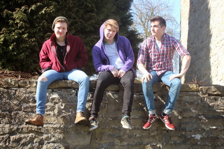
For my group shot I have used an out door area. this is good because of the natural light available and it a able to highlight and give genuine shadows and not ones created by artificial light. for this image I have used the wall the ground and the sky to divide the page into thirds. I have also done this with the models which has allowed me to create a grid style on the page which divides the sections up. with this image by using the wall and other features form the page this has allowed me to add another aspect to the magazine in the sense that I only have one detailed image in the whole magazine which allows there to be a contrast to the cover page and the rest of the magazine.

MY MAGAZINE
This is my music magazine cover, contents page and double page spread.

This is my magazine front cover I have chosen black and white as my main colour theme this is because the colours go well with the style of my magazine an I think that they would be best to appeal to my target audience. I have chosen to do a basic theme throughout my whole magazine because this is appealing as it will then stand out from others like it. I have used inspiration from magazines such as NME and THE WIRE this is because of their basic design and their clear lay out this is important with a magazine.


This is my magazine front cover I have chosen black and white as my main colour theme this is because the colours go well with the style of my magazine an I think that they would be best to appeal to my target audience. I have chosen to do a basic theme throughout my whole magazine because this is appealing as it will then stand out from others like it. I have used inspiration from magazines such as NME and THE WIRE this is because of their basic design and their clear lay out this is important with a magazine.
The contents page of my magazine has come form the contents pages from NME this is because of their basic layout and clear structure means that it is easy to read and it has a clear list of what is included. it involves images which make it more appealing and will help to make the reader want to look into the pages. I have used images with a short caption to show who is featuring ion the specific pages and what the main focus of them is.
this is my double page spread for my magazine I think that this image is good because it has a large space at the top right side. this allows there to be room for text and a summary of the artist that I am focusing on this specific page. this image fits well with the page because I will be able to put columns around the edge of the page and around the sides this is good because this will replicate the double page spread that I am taking most of my inspiration from.
Monday, 13 April 2015


PHOTOS - ROB AND JAKE


PHOTOS - GEORGE

This photo is over exposed this is because i have used a light that is to bright which has given a glare to the side of the models face which makes the shadow and the black screen out of focus.


PHOTOS - BEN

These were my initial photos that i had taken the first shot on this page is over exposed an out of focus. This image would not work because it has a strong shadow which does not make the image look professional.


This image is the best quality because it is not over exposed and the
angle that the model is facing at works and goes with the magazine its
self. This image can be edited to improve it because i would be able to
use photo shop to make the background darker and emphasise the contrast
from the model to the frame. This is important because this would allow
the final image to be of better quality.
Subscribe to:
Comments (Atom)